Chatree Campiranon
A career journal
I'm a Senior Staff Designer at Google. For twelve years I've built products that help people understand data and trust it.
Most of my work is internal so I can't show it. This page has the journey behind it, an example similar to my work, and older work I can show.
I joined Google Design in September 2014 and have spent the years since on data products: tools that help people across Google make better decisions. I design them and I build them. For a while I managed a team, then chose to go back to being an individual contributor, because what I love is building.
Now: an AI agent for data you can trust
People who build products have questions. Who is using this? What do they need? Where should we put our effort? I'm designing an agent that answers those questions from the data.
An example, not from Google. The box is an illustration.
It is nothing like a typical chatbot. The numbers have to be right, so the model never writes one. The data supplies every figure, and answers mix explanation with visualization instead of a wall of text.
The product is half of the work. The other half: data is only raw material until it becomes concepts and insights.
Someone has to work out the ideas first. Then design ways to explain them. Then help a whole company learn them, until people have real data intuition. That is as much my job as the interface.
To illustrate the kind of design I do, here is a mock analysis about economics and AI. It shows the storytelling side of my work. I also build tools that let people explore very large, high-dimensional datasets themselves.
An example: who can actually use AI?
This is an example, not my work at Google. I designed and built it myself with public data, mostly from the World Bank, to show how I think about explaining data.
The mock analysis starts with the big picture, four numbers that set the scene. Then it digs into two questions behind them.
The card marked Illustrative uses made-up numbers. The others use public data or a published estimate.
Who is online?
- Online
- Offline
Each square is about 50 million people.
Show the numbers
Being online is not enough. Price is the next barrier. Measured against what one month of an AI plan costs, the same four groups look very different.
Who can afford an AI plan?
Show the numbers
The analysis continues, with questions like these:
- Which countries are online but cannot afford a plan?
- How fast is that gap closing as prices fall?
About the data
World Bank Open Data, retrieved October 2026: internet use (International Telecommunication Union), population (UN Population Division) and income per head (GNI per capita, Atlas method), for the World Bank's four income groups: low up to $1,175 a year, lower-middle up to $4,635, upper-middle up to $14,375 and high above that, as the World Bank classifies them.
Income per head is an average and hides inequality inside each group. Incomes are in US dollars at market exchange rates, because a plan is priced in dollars. Adjusting for local prices (PPP) would make incomes in poorer countries look higher, but the plan would cost the same. Internet use is partly estimated.
Plan prices and token counts are examples. The AI use card shows Claude use in May 2026, from the Anthropic Economic Index (CC-BY), set against the same World Bank data. It covers the countries with enough use to publish (five low income, 29 lower-middle, 35 upper-middle, 51 high). Countries where Claude is not available, such as China, are not included, and one assistant is only a stand-in for AI use. Use per person online is my own measure, not the Index's per-capita measure. The AI users card uses Microsoft's AI Diffusion Report for Q1 2026 (17.8% of working-age people used a generative AI product, an estimate from device data) times the World Bank's 5.3 billion working-age people. The product breakdown card is made up for the example.
A good answer from the agent needs two things. The numbers have to be right, and the explanation has to be one people can follow. Neither is easy to promise, so I had to learn how to measure them.
Learning evals
The way to measure an AI agent is called evals, and I had never done them. I had no idea how to tell whether the agent was getting better.
One morning I asked my coding agent for help. I typed, "I'm going to write evals for the agent I'm building. Where do I start?"
An eval is a set of test questions and a way to grade the answers. Over the next week I learned to run it as a loop.
The first box took the most work. Agreeing with the data scientists on what "good" means is harder than it sounds. After that it was a loop I could repeat, and by the end of the week we had a steady way to improve the product.
I learned something bigger than evals. With an agent, anyone willing to dig in can take a real problem, even one beyond their usual role, give it a week or two and work through it.
You still need to know where the agent falls short. That is where I still work with people who have different expertise, like the data scientists who helped define what good means.
When craft stopped being the goal
After four or five years at Google, and after Inkling before that, the craft of design became intuition. Making things look right and work well stopped being hard.
That is only the surface of good design. In data storytelling, an easy and good-looking product still fails if people do not understand the concepts and the insights, or do not trust what they see enough to use it.
High craft is to be expected. The harder problem is delivering real value to the people who depend on the product.
In my case that means helping people at Google make better decisions.
A dashboard is a story
When people design dashboards they think about numbers and charts. I learned it is closer to storytelling.
Start with the framework: how will you plan the story? Once that is clear the content, the metrics, and the insights fall into place. Then tell it the way you would write a magazine piece, except the story isn't made of words. It is made of data.
Google Identity
Before the data products, I worked on a very different problem. On the Identity team I led cross-Google work so billions of people could understand and manage how their data and accounts are used across Google products.
Inkling
Inkling's mission was to make the world a smarter place with knowledge that matters. When I joined in 2010 we were building a textbook app for the iPad, before the iPad was even released. In 2014 Inkling was recognized as one of the most innovative companies.
I led the product design team and spent about half my time designing, mostly the iOS apps, from wireframes to assets for the engineers. The other half went to vision, direction, and research.
A couch device
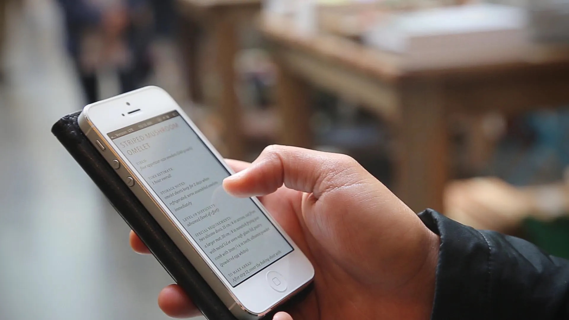
When we started, nobody read seriously on an iPhone. They had a Kindle. The Retina display on the iPhone 4 began to change that.
The iPad was new, so there were no conventions to follow. Apple's guidelines helped, but we knew it was not a giant iPhone. Over the first months we learned what it was. It wasn't for walking around or switching context quickly. You sat back with it. It was a couch device, and we designed for that.
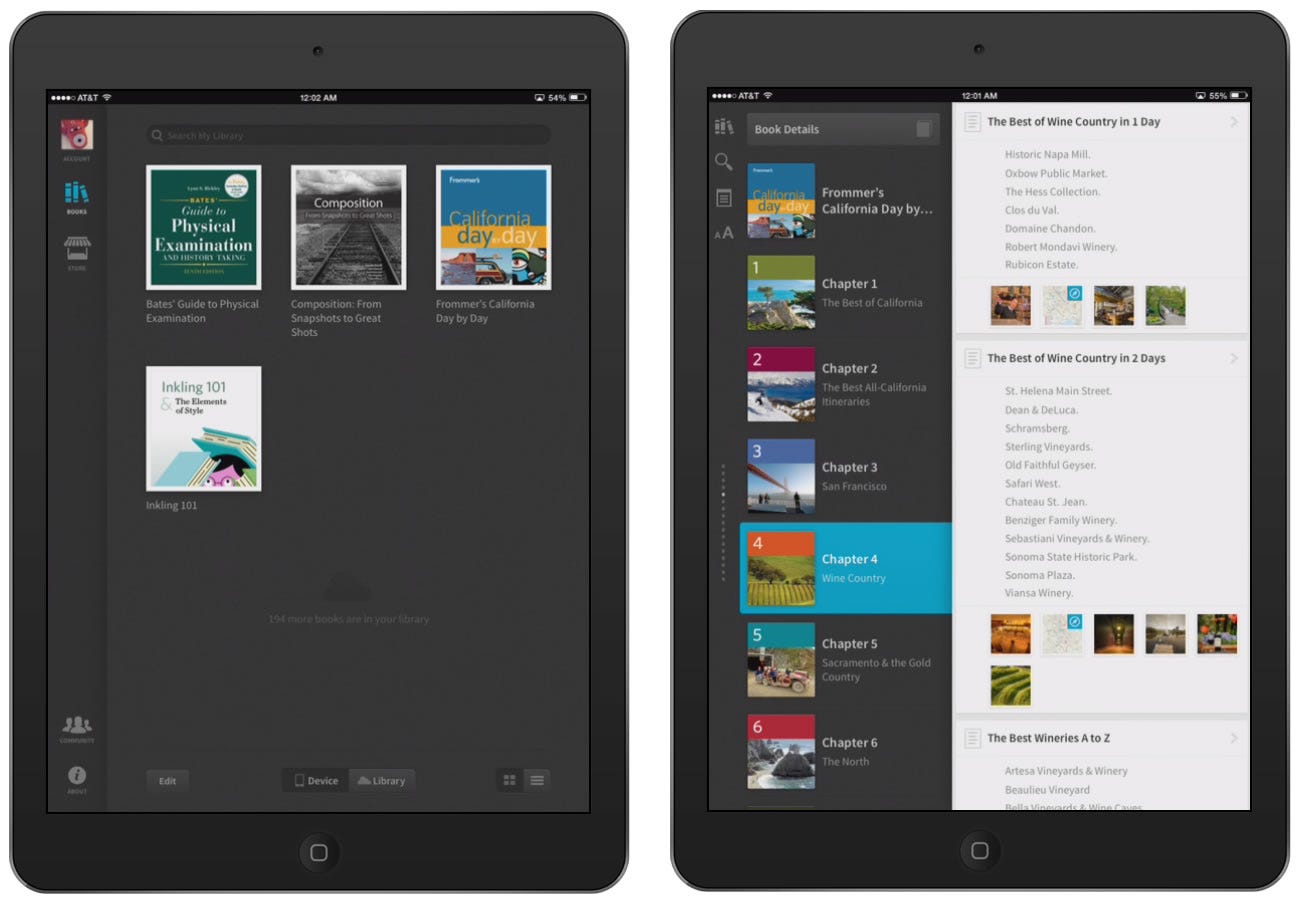
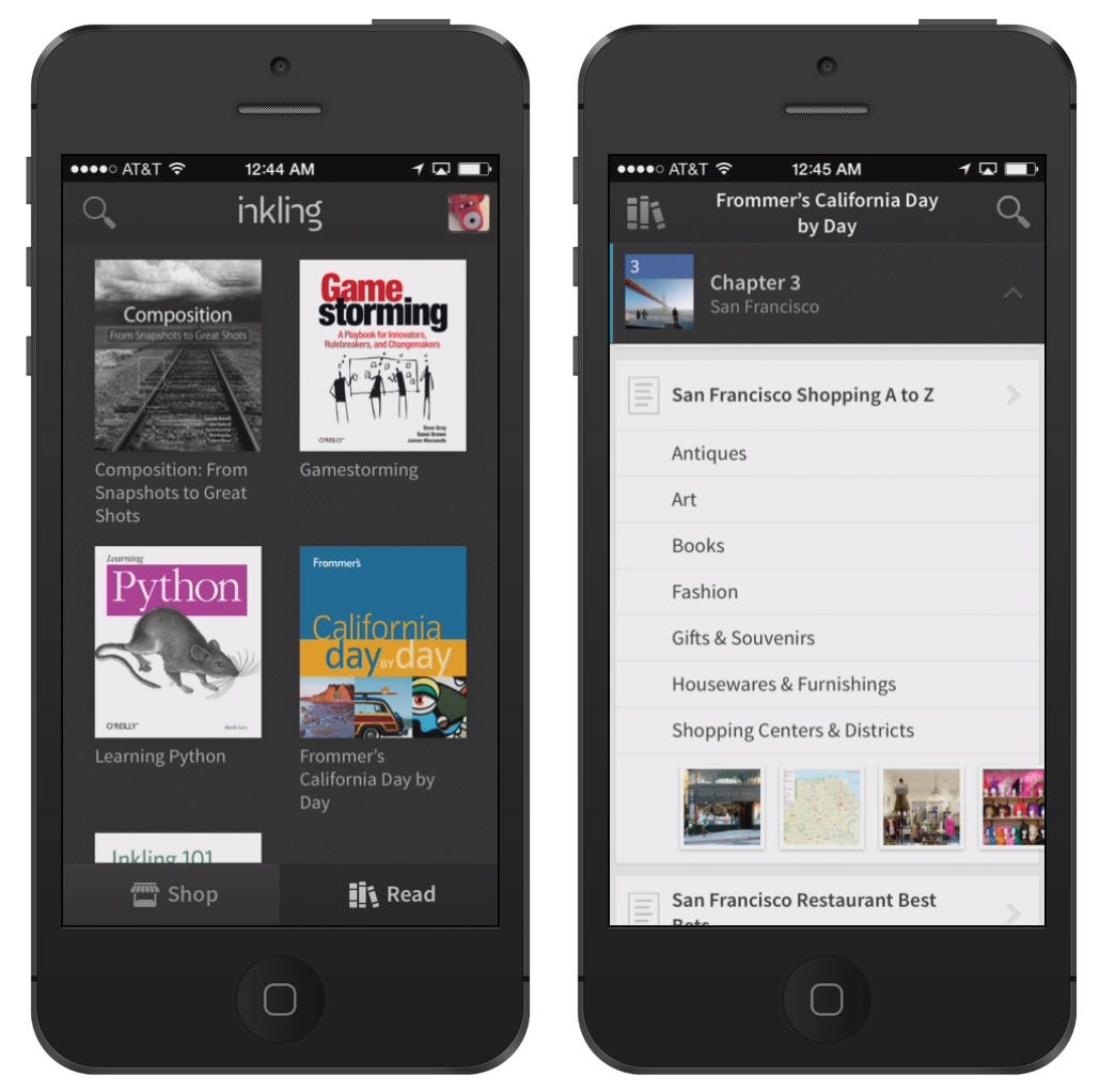
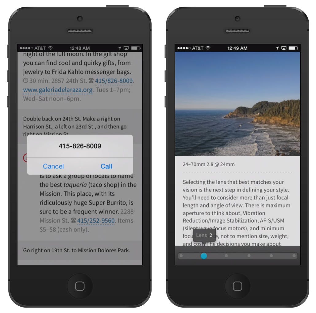
Navigation was the key to reading on a tablet. The outline view is built from the content's own metadata. It shows the book's structure, including figures and enhancements, so readers find their way much faster than with a table of contents.
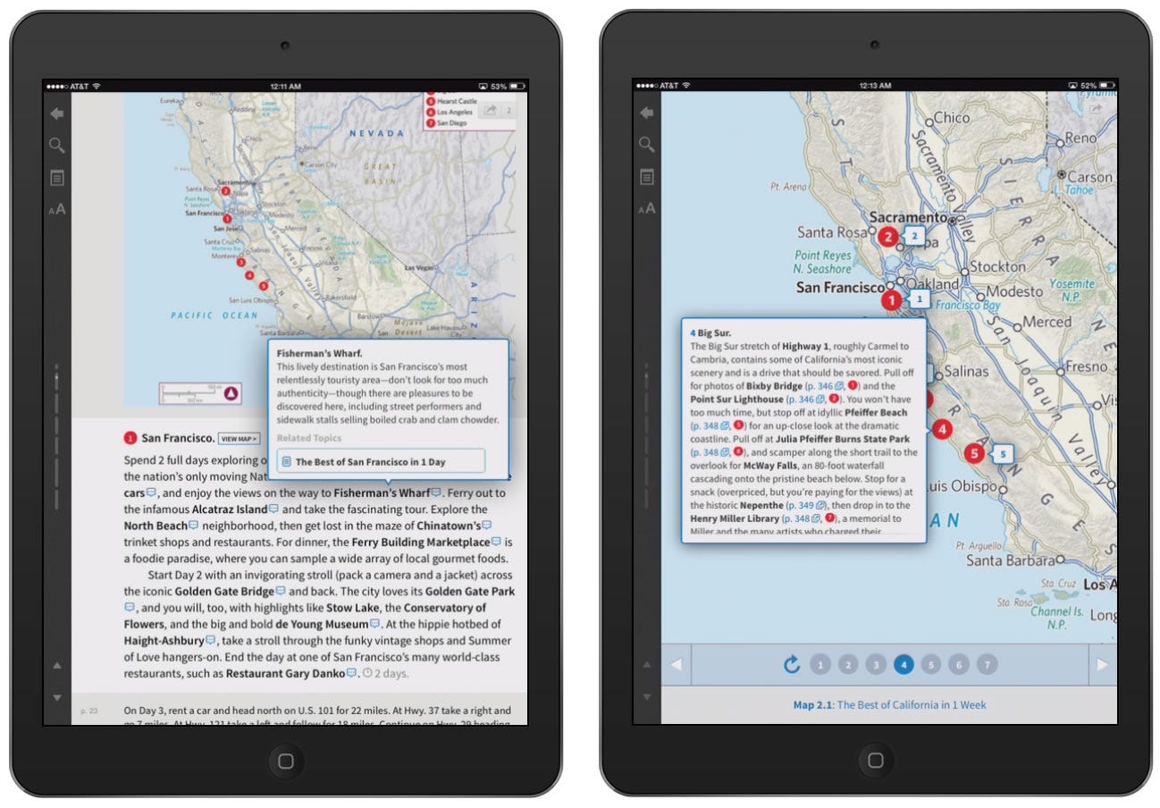
Content interaction was the other focus, especially in my first year. A small set of interaction patterns let the content team turn existing books into something that teaches better.
One thumb
Almost two years later we started the iPhone app. A new way of learning on a tiny screen wasn't a good idea until the Retina display gave us readable text. Once again the hardware made the design possible.
I wanted the iPhone version to work with one thumb while you hold the phone. We added a quiet mode that removes the chrome while you read, and a one-column outline. We reflowed all the content to fit the phone, which became the base for Android later.
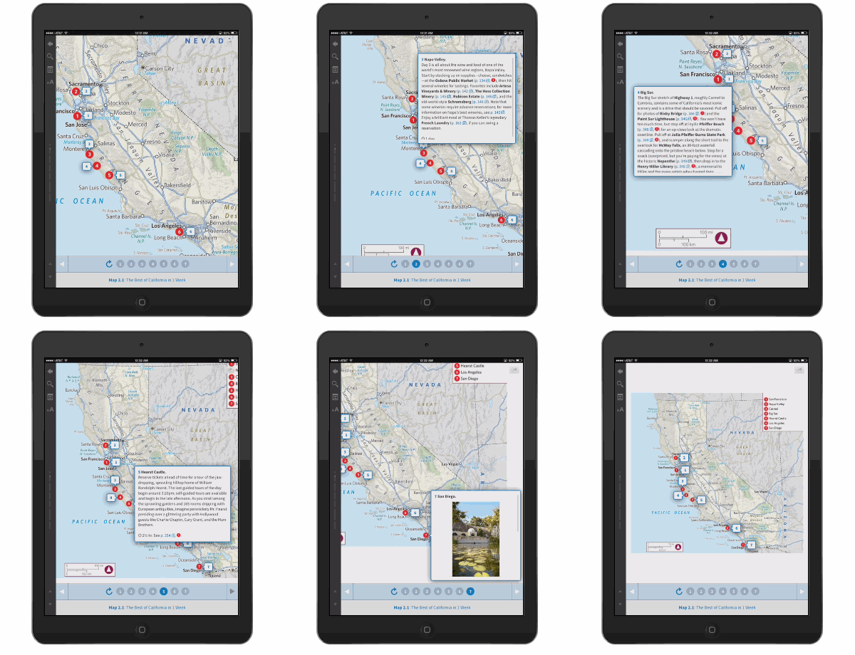
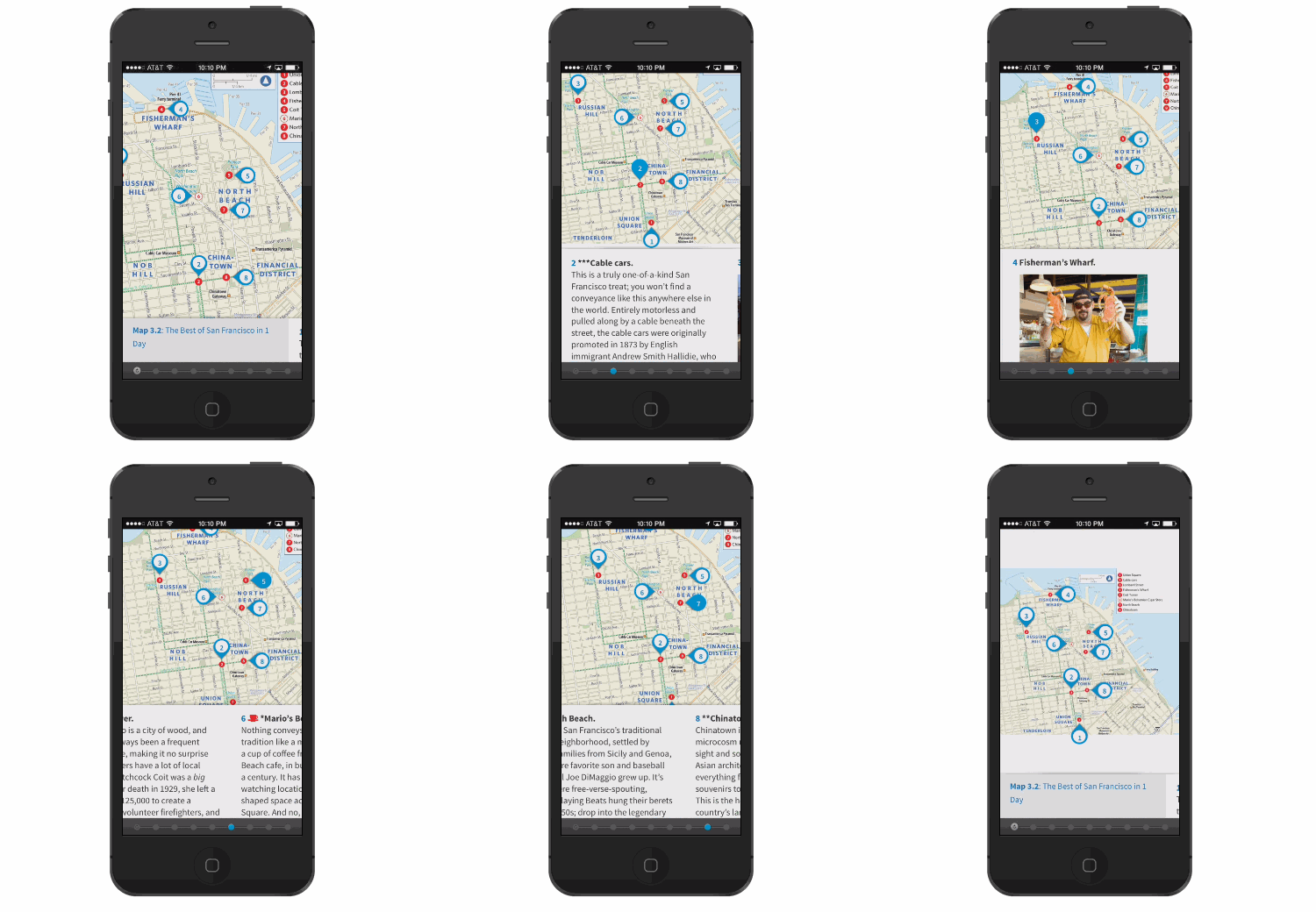
The guided tour shows how this played out. It walks a learner through an image or diagram one step at a time. On the iPad you tap the pop-tips, the numbers at the bottom, or the arrows. On the phone there was no room for numbers, so every step went into one ribbon. You can tap it, but you'd probably miss the target, so you swipe with your thumb instead. Nothing had to be given up to get there.
Other products
Over four years we also built the rest of Inkling: a web reader, an Android app, a platform that let Google index our books, Habitat for enterprise publishing, and the store, my first design task. One lesson stuck. Renaming "content preview" to Open Inkling changed the design, and showed me how much naming frames it.
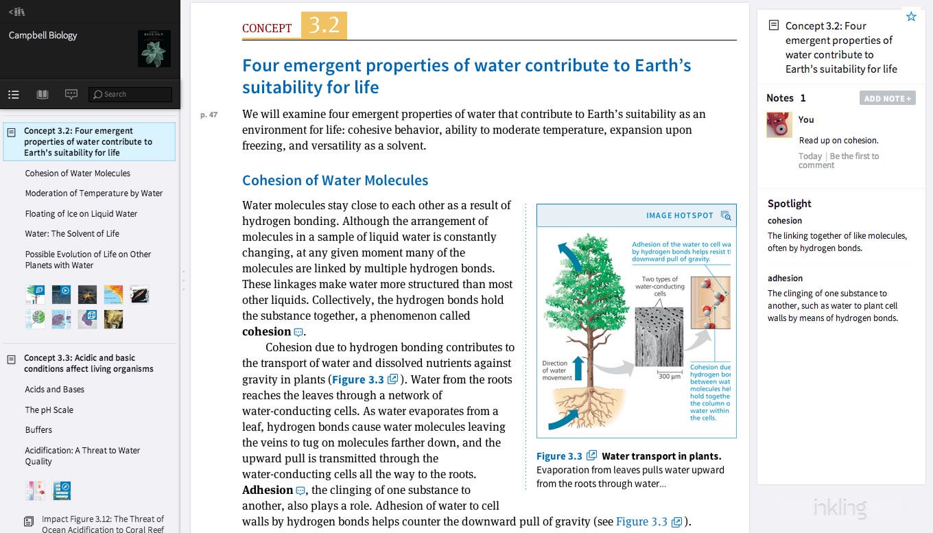 Inkling for Web, 2012
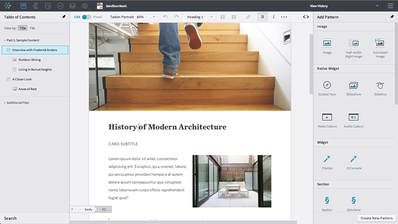 Inkling Habitat
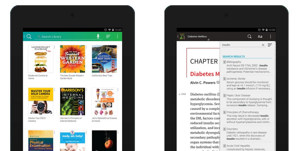 Inkling for Android, 2014
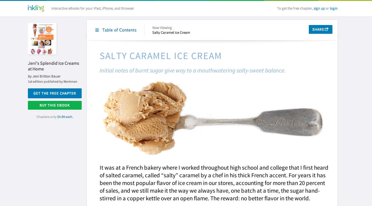 Content Discovery Platform
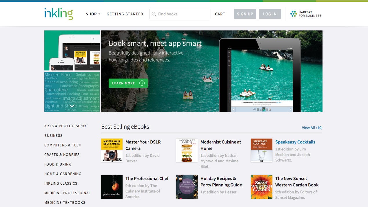 The web store
The people
Inkling put me around the best and brightest people I have worked with, and also some of the nicest. I learned a lot from fellow designers and mentors.
I was ok at interaction design when I arrived. The craft came from there: the little things, like the shades of a color, typography, and how a product feels.
Side projects and interests
Things I have made along the way. Some started at work, most didn't.
A deck of charts
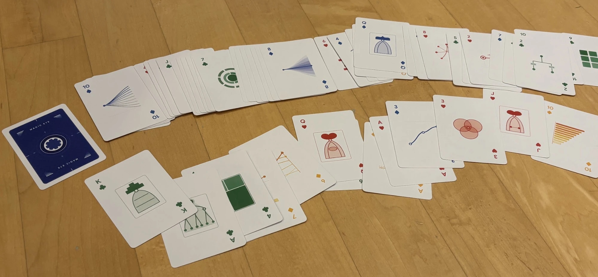
I concepted and designed it as team swag, a nod to our problem space. The four suits are four chart families, and each card's number is encoded in its chart.
- Trends
- Hierarchies
- Overlaps
- Rankings
Evolution of Search
Once a year Inkling held a two-day hackathon called Extra Credit. I usually built product features. In 2013 I made a video about how Inkling could put its knowledge in front of the world through Google.
We prototype software all the time, and a video took us out of our routine. I concepted, directed, shot, and edited it, to show where the company could go.
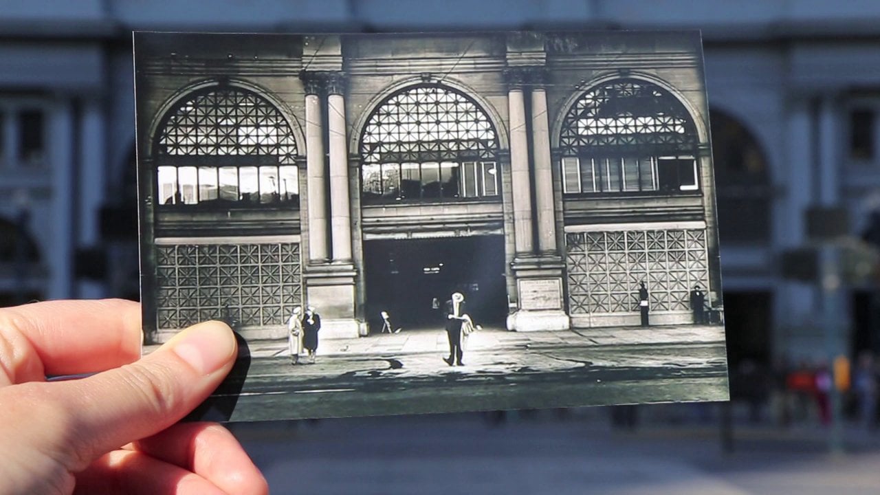
It stayed with us. When new people joined Inkling, we showed it during onboarding as something to aim for.
BubbleStacks
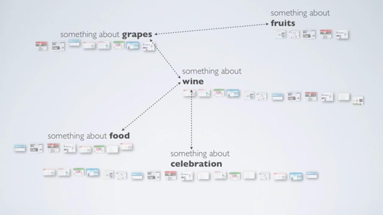
My friend and I entered an open-ended Mozilla Labs design challenge: how to make the Firefox new tab useful, since people open one to start their next task.
Our answer grouped a person's history by intention, like planning a trip or finding a pasta recipe. It won Best in Class for Innovation, and we were invited to write a guest post about collaborating remotely across the miles.
Photography
I used to shoot much more with my DSLR before the iPhone took over. In the end I kept one lens, a 35mm f/1.4. One prime lens frees you from choices and leaves you with the moment and your best composition. My favorite subject is street photography.



Earlier
Computer engineering
My undergraduate degree in Thailand was in computer engineering. What I took from knowing how code works is the ability to think systematically. Every designer should learn to code for that alone. No single language matters, since the one you master is probably obsolete by then. Systematic thinking stays with you and helps you talk with engineers, and being able to prototype is too powerful to give up.
Human-computer interaction
I was the first graduate in Human-Computer Interaction at Indiana University-Purdue University Indianapolis. In 2003 Facebook and Google's apps didn't exist yet, and MySpace was still relevant. We learned interface design from classic books of the 80s and 90s. In usability sessions we put a mirror by the monitor so the camcorder could capture the screen and the face together.
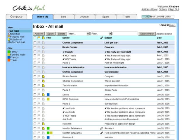
My thesis was about email management: formative and summative research on a prototype, compared with Gmail and Yahoo! Mail. I coded the front end and back end myself, in PHP, which was still a thing then.
User research
After my master's degree I spent about two years as a usability specialist at Pearson Education, running the usability lab for the UX team. Empathy is a great foundation for a designer, and I still push designers to run research, even to talk to strangers in a coffee shop. Just remember to buy them coffee.
Say hello
If you build things, I would be glad to hear what you are working on. I'm drawn to 0-to-1 work, where designing and building are the same job. LinkedIn is the best way to reach me.